Data-Driven Holiday
Here's a blog post about how I planned a long weekend stay in London using maps, data, and statistics. This was just a weekend project, but I went a little overboard.
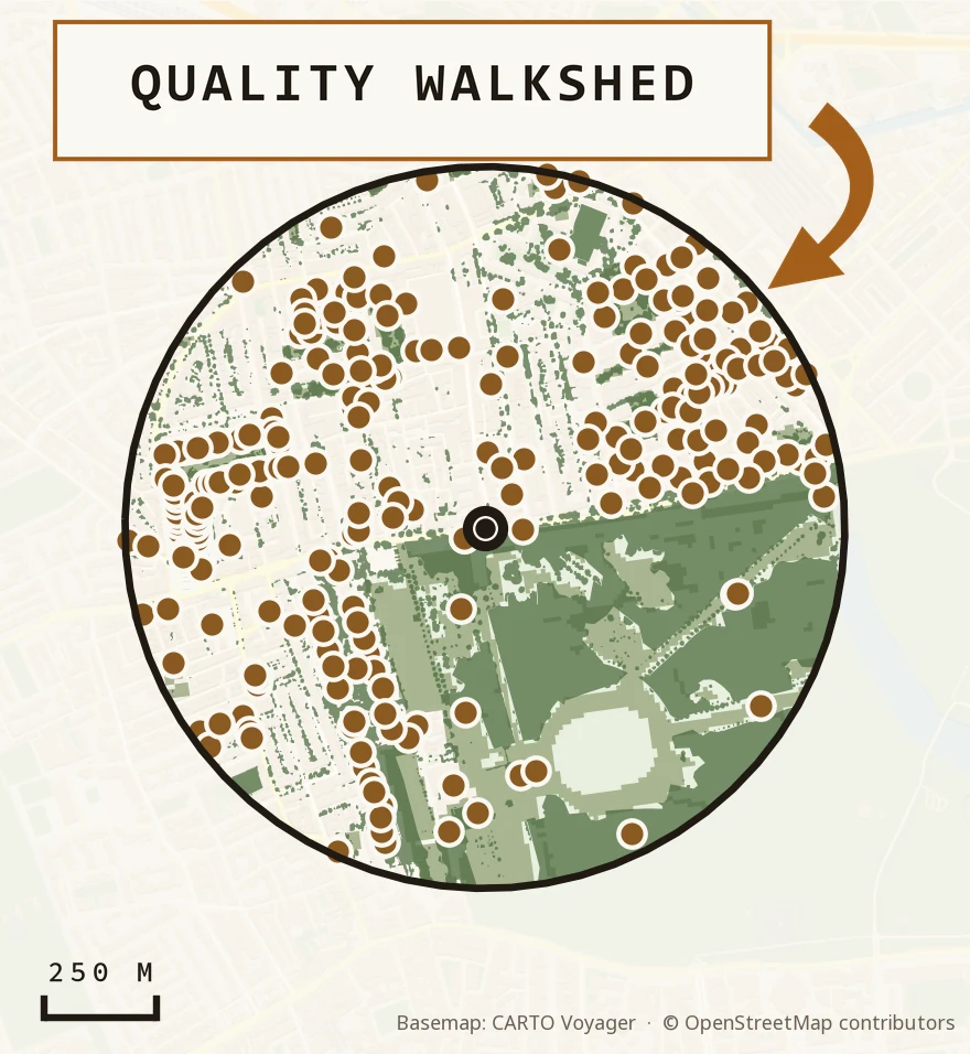
Here's a blog post about how I planned a long weekend stay in London using maps, data, and statistics. This was just a weekend project, but I went a little overboard.
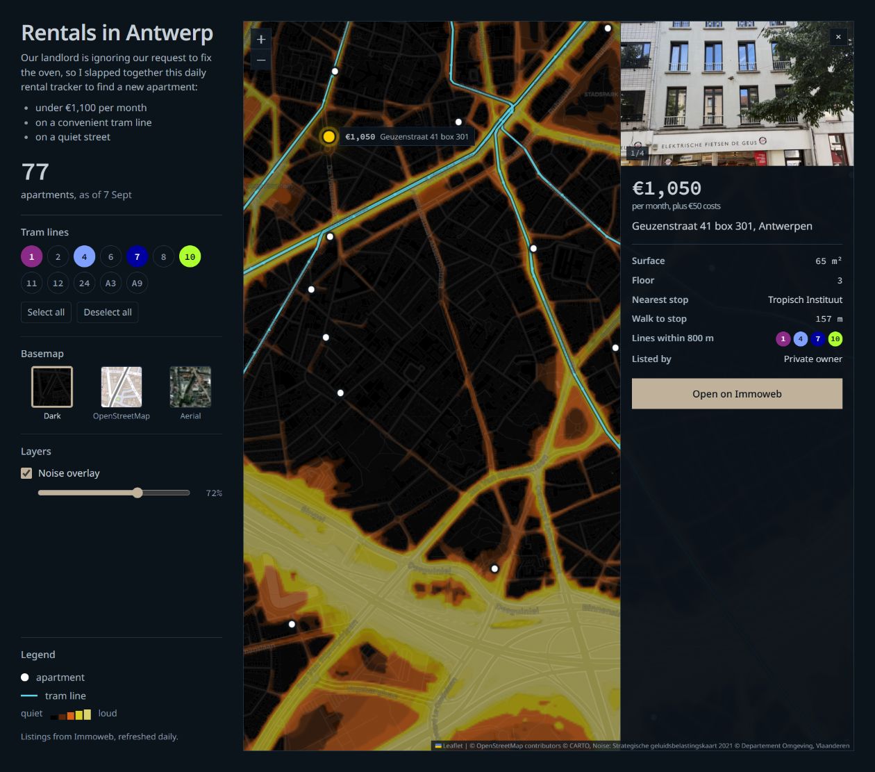
Our landlord keeps ignoring our request to fix the oven, so I slapped together this dashboard to find a new apartment within our budget. It searches for 2-bedroom apartments within 800 meters of a tram stop, and by default, it's set to the tram lines most convenient for my wife's commute. I also prefer a low-traffic street, so I added a road noise layer from the Flemish government.
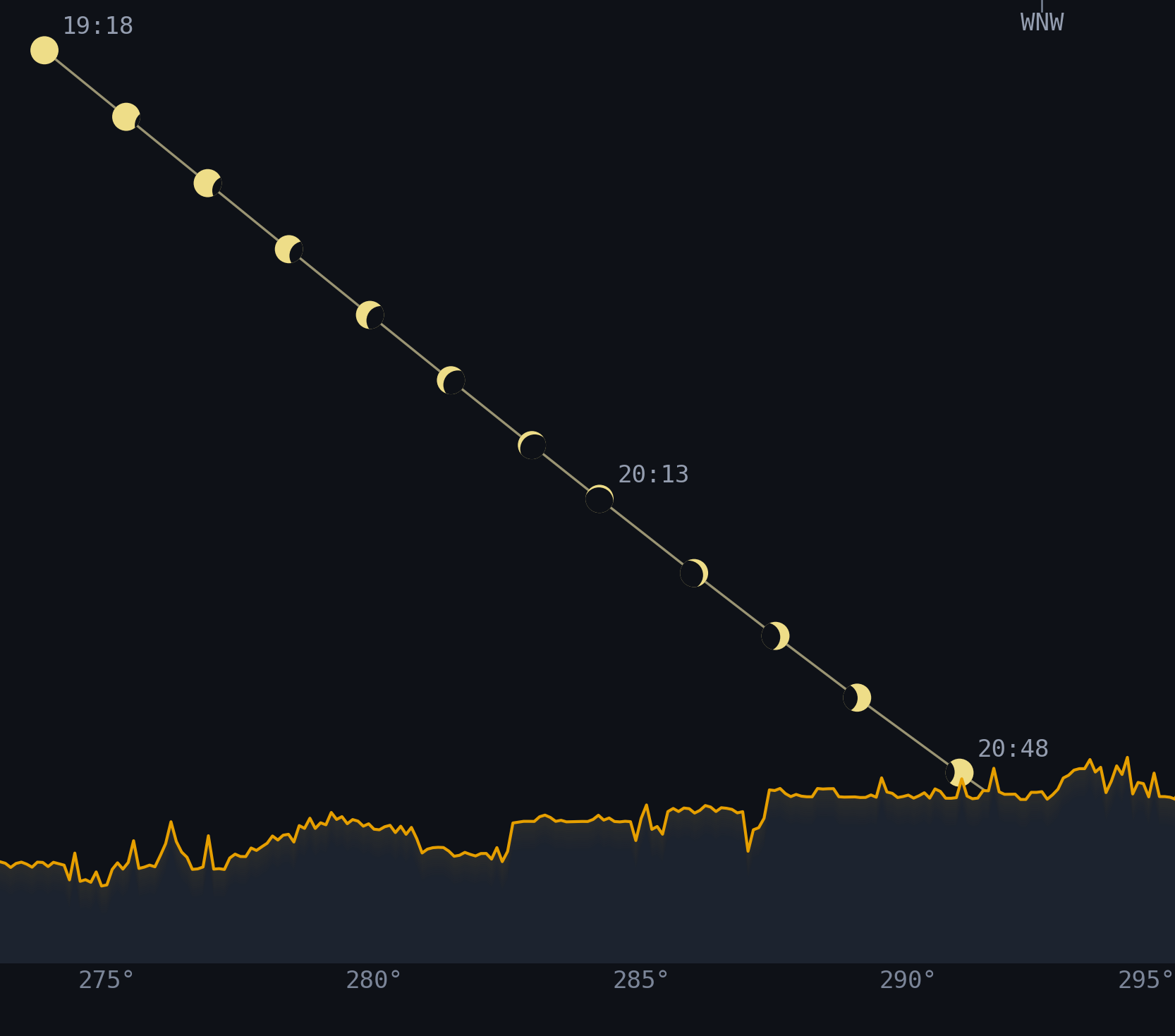
On August 12, 2026, a partial solar eclipse was visible from Antwerp. I wanted to know if trees and buildings would get in the way, and where I could get the best view. I spent two days combining lidar data, 3D building models, and solar-position calculations to reconstruct the skyline from five possible viewing spots. Then I turned it into a shareable webpage that's accessible enough to read on the toilet. The code and methodology are available on GitHub.
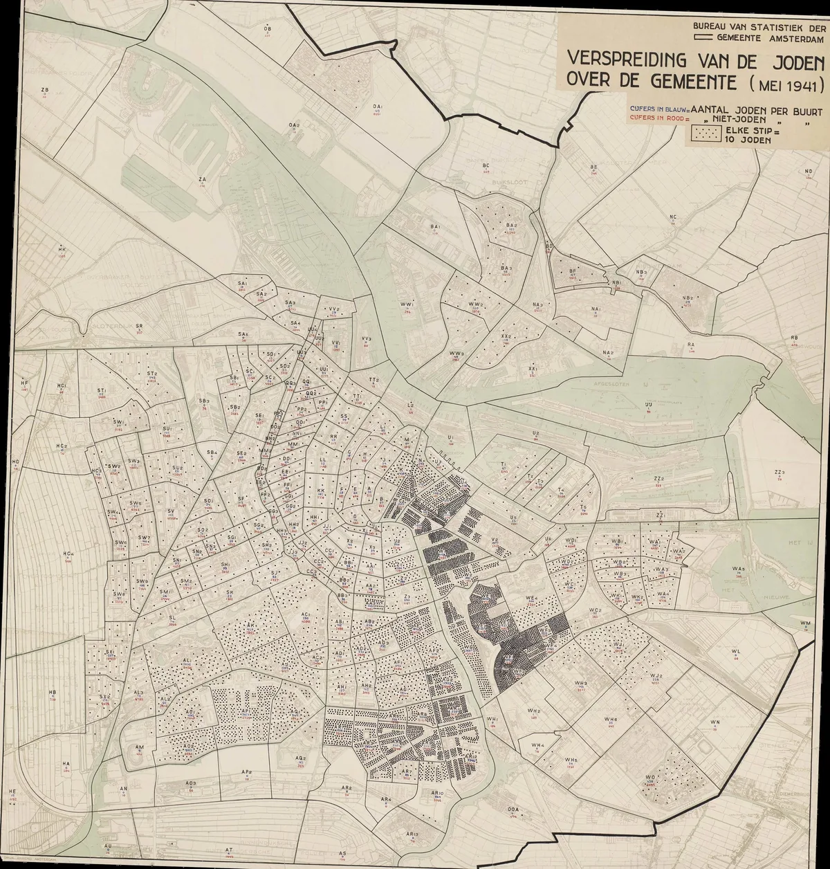
I like old maps. When digitizing them, I find myself drawn in by the subtle defects, like rips in the paper, typos, and squiggles in hand-drawn lines. The stippenkaart was different. It was created by an Amsterdam city employee to mark the homes of Jewish residents. The occupying authorities used it as a tool in the mass deportation and murder of approximately 60,000 people.
When I came across it several years ago, I was struck by the symbology of using dots to represent people, and the idea of turning it into a memorial stayed in the back of my mind until I began this project. With recent improvements in agentic A.I. tools, I was able to actualize the concept of using dots to symbolize human souls. I finished this project in about a two-week sprint, and at times, I was genuinely brought to tears.
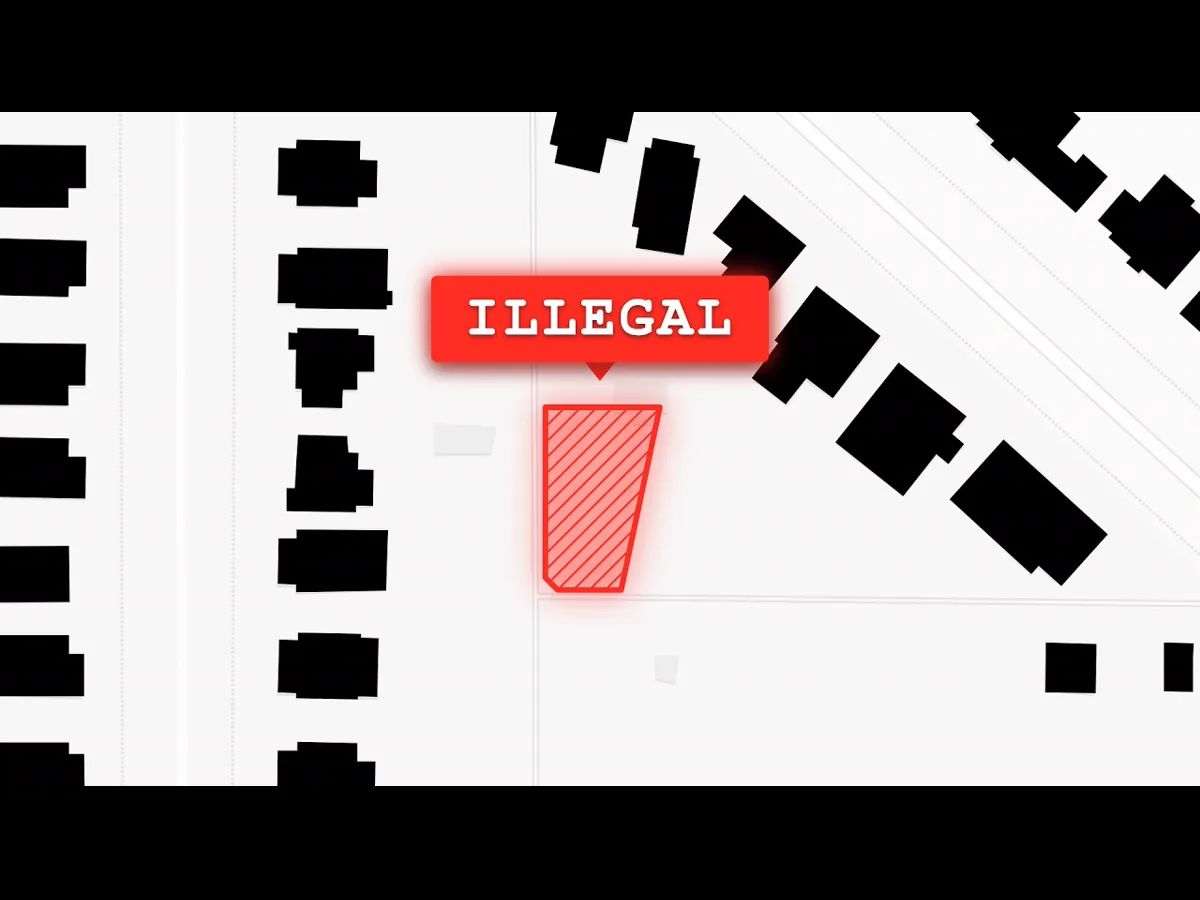
For this project, Hoog and I tried an experiment. Using an advanced AI-assisted workflow, we found failed housing projects that were documented by local government bodies. With these videos, we shined a light on the NIMBY tactics and byzantine rules that prevent housing from being built. I was involved in the curation, scriptwriting, and geographic information processing. The last of these included querying a self-hosted PostGIS database, performing Python-based spatial analysis to determine alley lots, and cleaning data in QGIS.

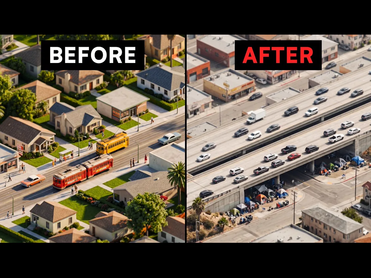
I researched and wrote this script for Hoog about Los Angeles. The piece is focused on how streetcar suburbs were built by private companies before the city was transformed into a car-centric hellscape. It tells the story about a series of unfortunate policy decisions, shifting consumer habits, and a conspiracy that went all the way to the top.
This script was a collaboration between Hoog and Works In Progress magazine, based on an article written by Ben Hopkinson. The piece is about how Madrid was able to build its metro so quickly and so cheaply, while cities like New York flounder. It was a pleasure to adapt a fascinating and well-researched article to a screenplay format.

This screenplay ended up being a lesson in the principle of "less is more." Sometimes you have to know when to cut down your extensive research for the sake of simple storytelling and atmosphere.
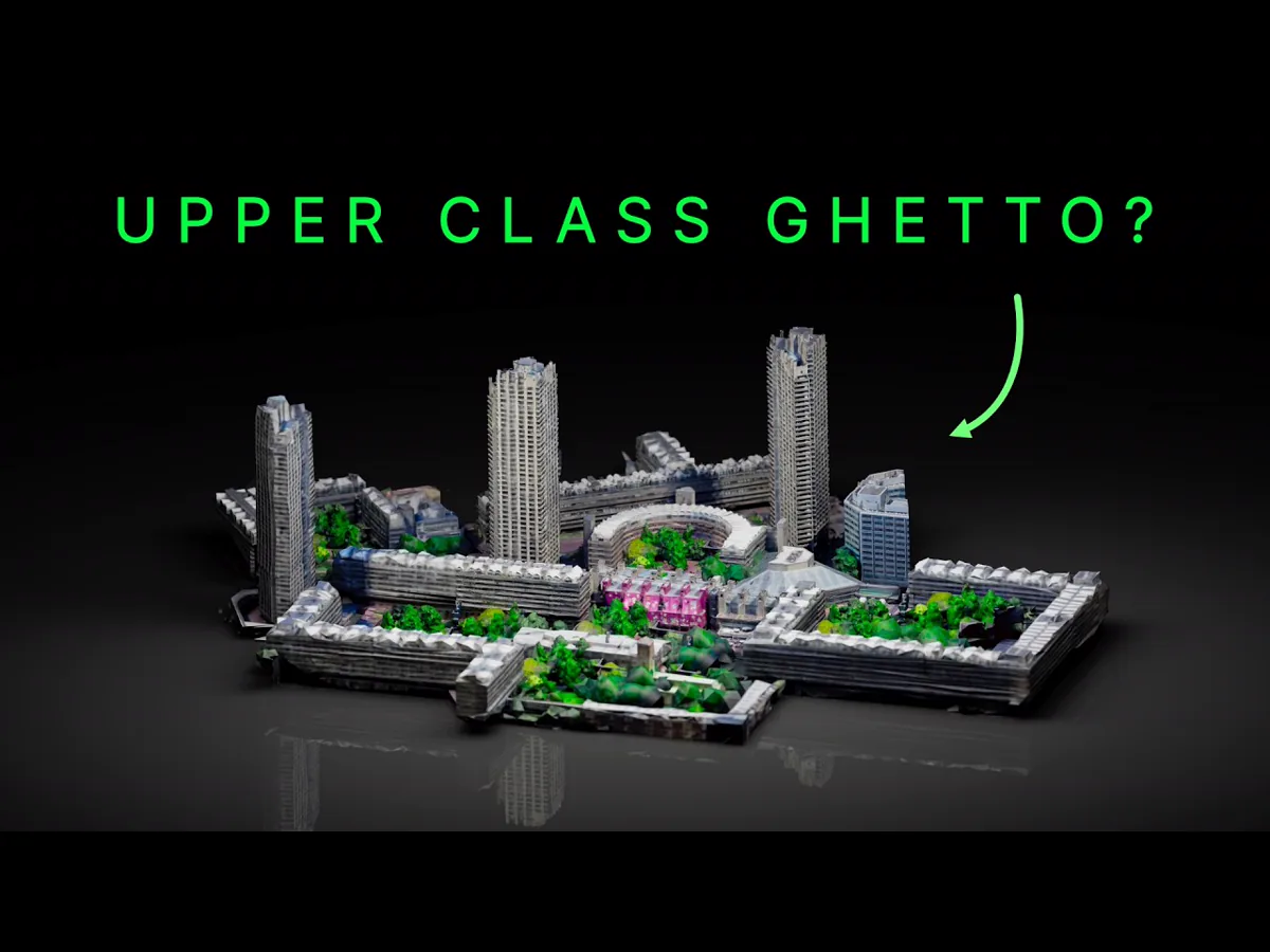
I'm proud to have been a small part of a large team of researchers, writers, interviewers, and talented artists and editors that made this ambitious video possible. I think we might have accidentally gotten Rob Jetten elected prime minister. 😳
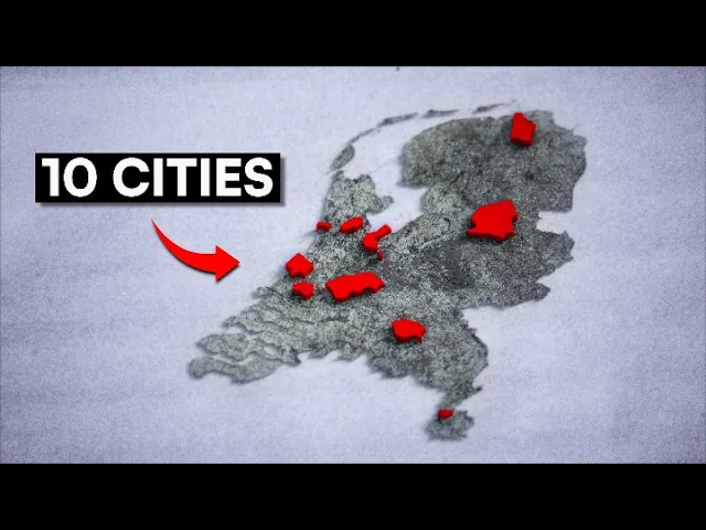
In another collaboration with Hoog, I explained the forgotten plans for New York’s subway. This was my biggest project yet, involving intensive research about a dense urban planning topic. The result was a script that had to carefully balance complexity and clarity. This project was also a huge learning experience for integrating map-making into a video production pipeline.

This collaboration with Hoog was about a mid-century proposal to run highways through the middle of Amsterdam. Crazy! Sadly, there was a lot of fascinating material that had to be cut for the sake of a deadline. Nevertheless, it was a great experience in storytelling and working with maps in video production, and I'm proud of how the result lifted history off the page.
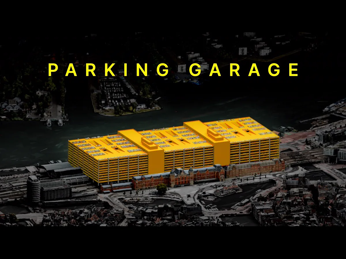
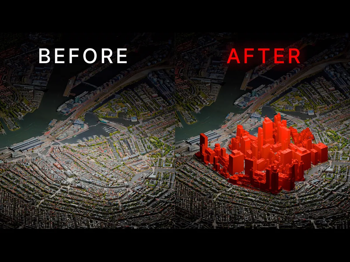
I collaborated with Hoog to write a screenplay about an ambitious young urban planner on a quest to build skyscrapers in the Netherlands' most important city. The infotainment piece uses character-driven storytelling to explain the complex social, political, economic, and geographical realities that can thwart urbanist idealism.
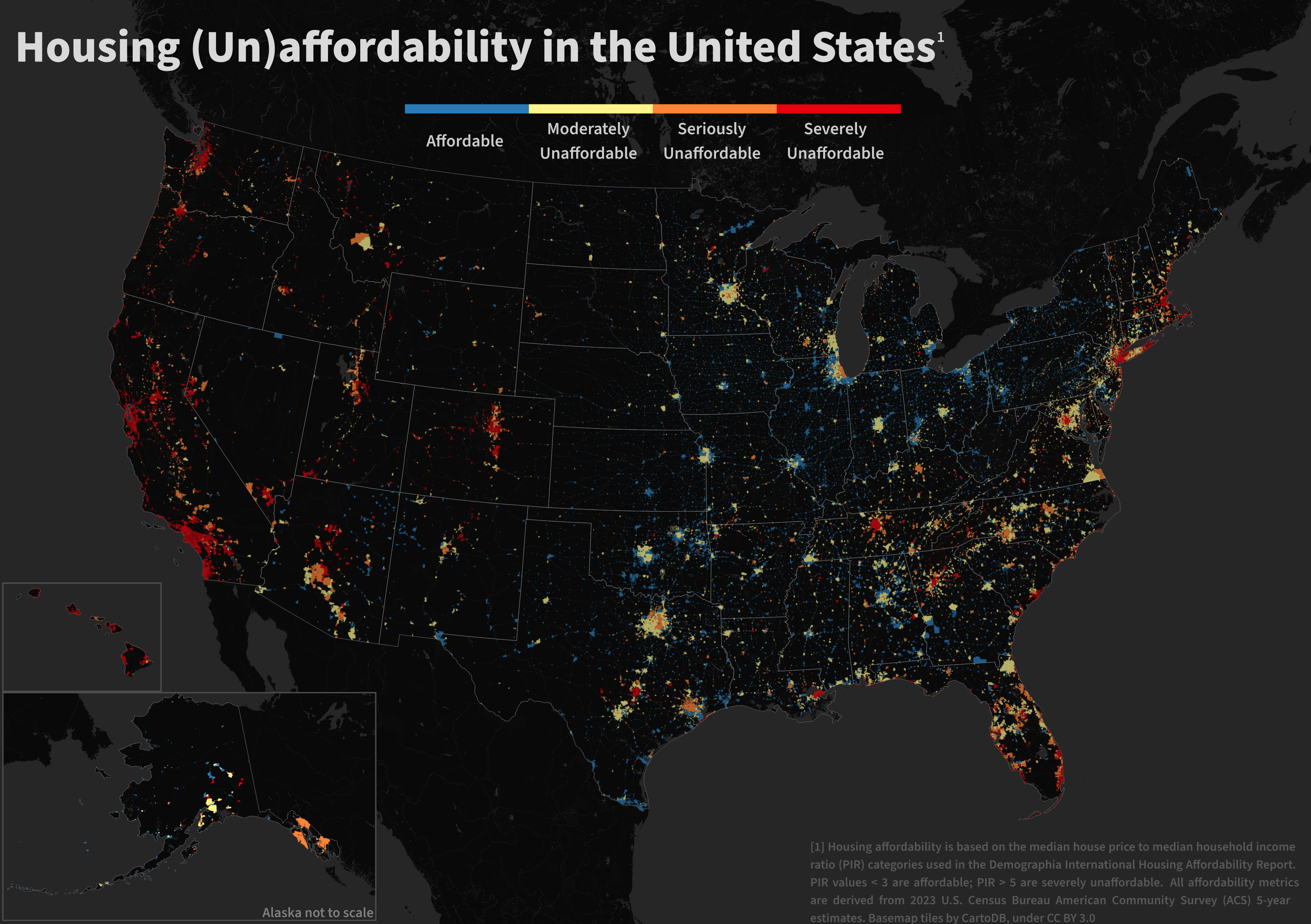
I used R to compile data from the U.S. Census Bureau, creating a nationwide dataset on housing and population characteristics. From this, I calculated the ratio of median house price to median household income, a standard way to measure housing affordability. I mapped the results across ~32,000 communities, grouping them into clear affordability categories. To make the map easy to read, I used a dark background for contrast, a high-visibility color scale, and kept labels and legends simple. The result is a national map that shows housing affordability patterns clearly and at a glance.
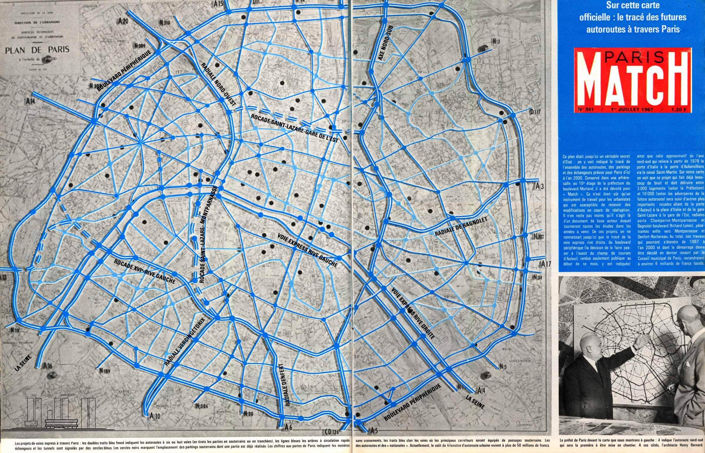
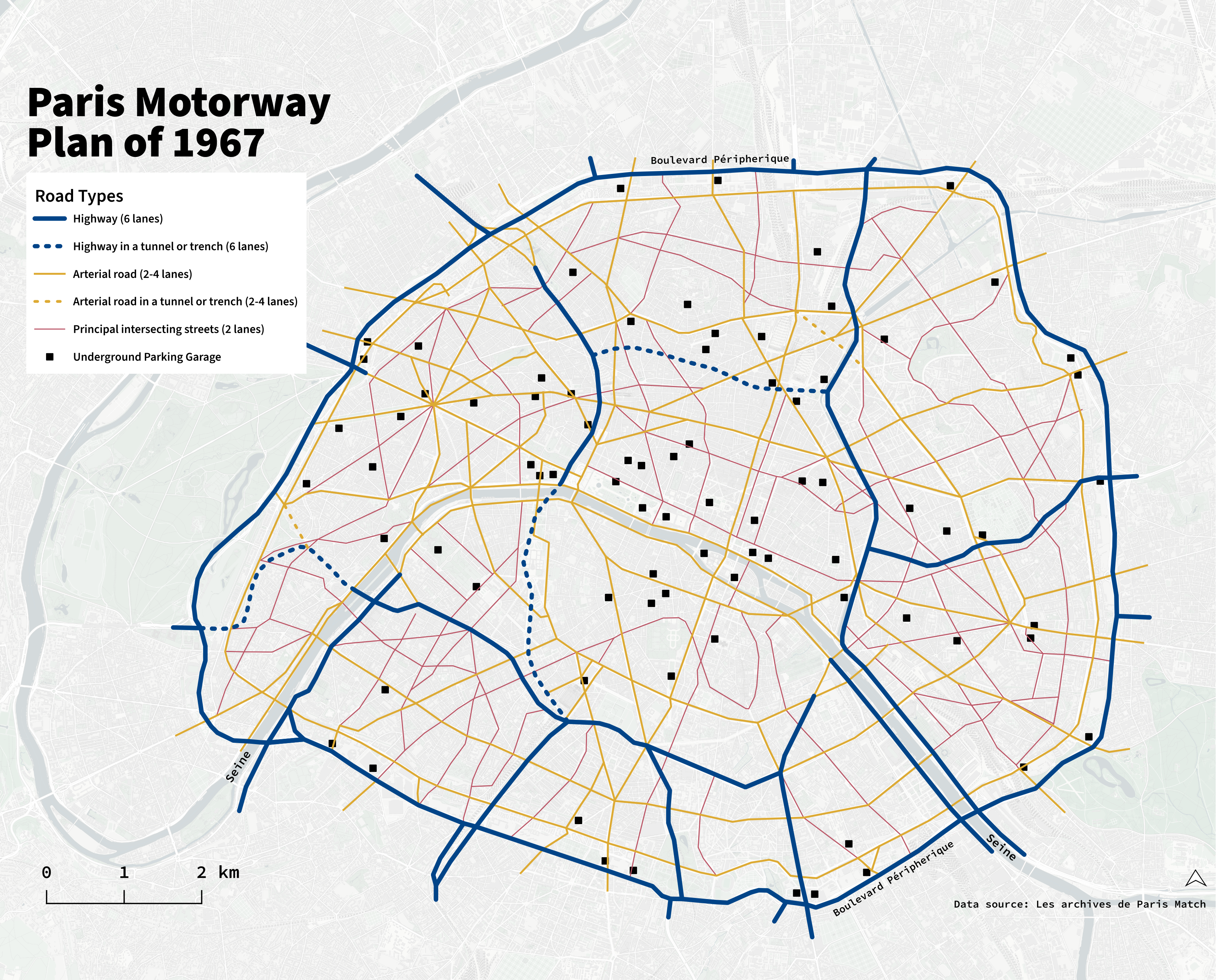
I digitized and redesigned an archival map of Paris that showed plans for highways through the city center. The original map used similar colors and symbols for different features, which blurred distinctions and created clutter. I corrected this by designing a new symbology that establishes hierarchy between map features, improving clarity and usability. The redesigned version employs an accessible, colorblind-friendly palette based on the work of Paul Tol.